
MICHELLE: Welcome to the second installment of Let’s Get Visual, the monthly column in which MJ (of Manga Bookshelf) and I attempt to improve our admittedly lacking skills in visual analysis!
In the comments section of last month’s post, it was suggested that we choose selections that would allow us to “examine movement and panel-to-panel storytelling.” This notion intrigued us, so MJ and I have done our best to fulfill this request, though I must admit that mine doesn’t exactly meet the qualifications of an “action-heavy scene.”
MJ: I admit I found the request a little daunting. Though I read a lot of manga that contain action sequences, I tend to kind of zone out during many of those moments, particularly if I find the action difficult to follow. Then I realized, of course, that this offered a great opportunity to think about instances in which action scenes really work for me and why.
MICHELLE: When we first received this request, I thought I might end up choosing a fight sequence from One Piece, but in the end, I found a low-key scene that nonetheless inspired awe. But enough of me, why don’t you start us off this time? And remember, folks—all images can be enlarged by clicking on them.
Banana Fish, Volume 8, Pages 130-135 (VIZ Media)


MJ: Since we just finished the latest installment of our roundtable discussion, Breaking Down Banana Fish, I had Akimi Yoshida’s Banana Fish on the brain, so the pages I’ve chosen are from that series, late in volume eight. The story’s protagonist, gang leader Ash Lynx, is engaged in a showdown with his enemy, Frederick Arthur. The fight was supposed to be one-on-one, knife only, with a neutral witness in a closed subway station, but Arthur has used his mob ties to pull off an ambush with a subway train full of his gun-toting boys. Once Arthur breaks the rules, though, the fight’s original witnesses (there end up being two) call out their own boys to back up Ash, so Arthur’s gang attempts to retreat on the same train they arrived in. That’s where these panels begin.
What really strikes me here is Yoshida’s use of sound effects throughout these panels. I’m the kind of reader who generally ignores sound effects, but here they are vital to the tone of the scene. In this empty, echoing subway station filled with a lot of really tense guys, it’s the sounds that drive their responses more than anything. Sing’s gang bursting out of their hiding places, Ash’s gun releasing its empty shells onto the cement floor, bullets reloading, the echoing gunfire, and then the labored clacks of the subway train pulling away, leaving Cain and Sing behind in the emptiness of the station—these sounds dominate each page and move the action forward. Whoever’s decision it was to translate these sound effects into English really made the right call, in my view, because this entire sequence would die without the full comprehension of the sounds.
I particularly like the second-to-last page, in which both Ash and Arthur stand separately, with only the heavy clack of the train and the sounds of their own, tense, breathing in their heads. That panel makes the silence surrounding Cain and Sing on the last page feel even more intense.
MICHELLE: I think you may be on to something there. Now that I’ve reread it and paid special attention to the sound effects (which, by the way, I always read, even if they’re in katakana!) I can completely see how the loudness of the train followed by the absence of sound emphasizes the emptiness of the station as well as Ash’s shocking departure.
When I first read this scene, the part that struck me the most was the top right of the second two-page spread, where Ash eyes the door, we see a foot, and then he comes sailing through it. I love how this was conveyed so economically, and in a way that allows us to fill in all the steps in between.
MJ: I’m really glad you brought that up, because I think economy is really the key in drawing clear action sequences. Some of the backgrounds here are pretty cluttered, due to the heavy graffiti on & in the subway cars, so it’s the clear, simple action shots that help keep our focus. There are a lot of speed lines here, but they are thin and subtle, drawing our eyes in the right direction without making us aware of them. And her choice of details is spot on.
For instance, when Ash is ripping tape off of his leg to get at the extra bullets he carries, Yoshida focuses on Ash’s pained face as the tape comes off, rather than the action itself, with the sound effect cluing us in. Then she follows it up with a close-up on the bullets going into the gun. She goes from precise actions like these into increasingly broader frames, until the bottom of the page where we finally see Ash opened up against Arthur’s gang. It’s so effective, the way she takes us from the tense intimacy of Ash’s personal space into the vulnerability of the wide-open platform, so that we experience the progression just as he does.
MICHELLE: That’s an excellent description of what’s going on. Interestingly, the consideration of perspective—where our characters are in relation to the world they inhabit—figures large in my example, as well.
MJ: Let’s talk about that then, shall we?
BLAME!, Volume 6, Chapter 36, Pages 152-155 (TOKYOPOP)

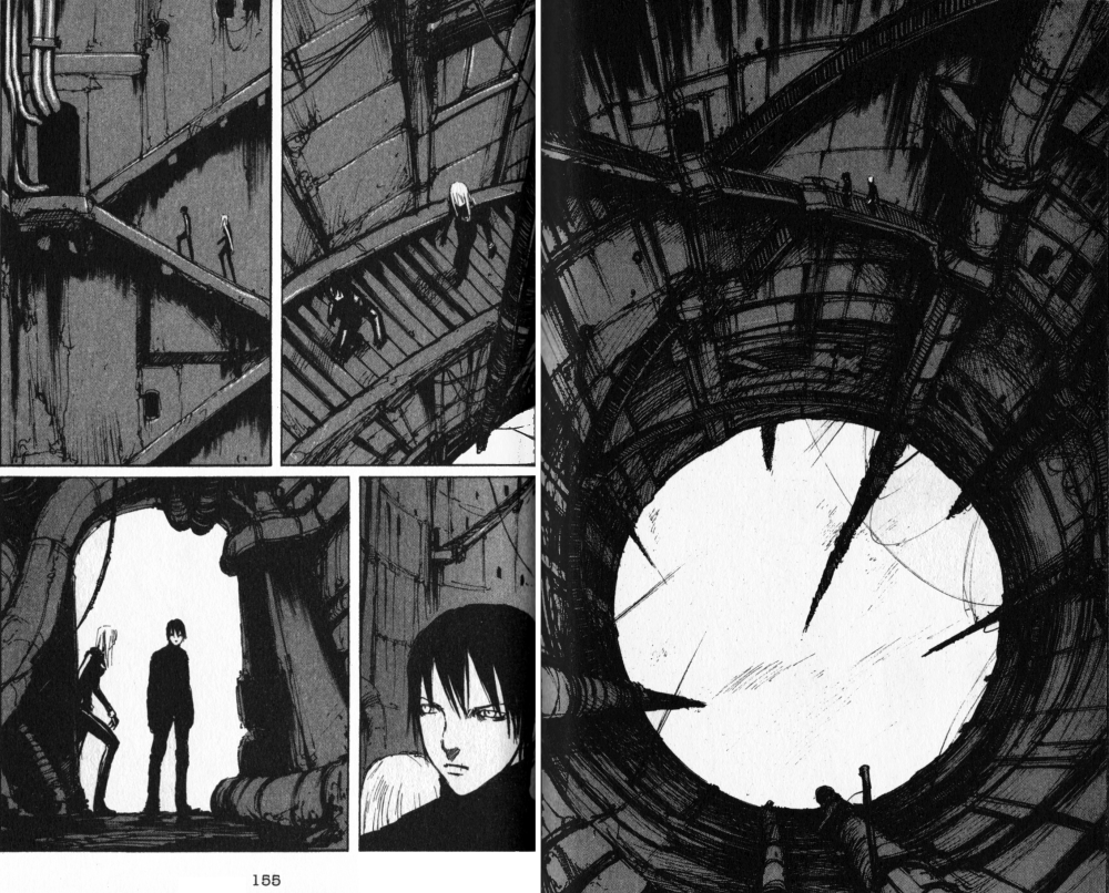
MICHELLE: Alrighty. I’ve selected four pages from Tsutomu Nihei’s BLAME!, not for the action—which essentially consists of two people walking around—but for the elegant panel-to-panel storytelling.
BLAME! is a rarity for me in that it’s a series that interested me because of its art rather than it’s story. BLAME! stars Killy, an emotionless young man equipped with a powerful gun, and depicts his journey through a labyrinthine structure of concrete and steel as he searches for humans containing “net terminal genes,” which will allow a person to interface with the netsphere that originally created the sprawling place. The reviews I read praised Nihei’s architectural sensibilities, which was enough to sway me to check out the series. Along the way, Killy acquires a companion in Cibo, whose origins are too complicated to go into, and they begin to journey together. In this sequence they’re ascending to another level of the massive structure, hoping to find a lab where they can read a genetic sample they’ve acquired.
We first see them climbing up a long, spindly column as they approach a circular opening in the roof above them. From the swirling mists and lack of a floor below them, we get the sense that they’ve already been climbing for a long time. In the next set of pages, Killy and Cibo are suddenly walking up a staircase, but the perspective of the scene—showing the circular opening and the column descending out of sight—make absolutely clear how their new position relates to their old one.
On page 155, Killy and Cibo approach a door. This door has four pipes coming out from it, three going up and one to the side. At the bottom of the page, Killy and Cibo are now silhouetted against an opening, and even though we’re looking at them from the other direction now, there are those pipes again, showing us clearly that they’ve now stepped inside.
BLAME! is full of scenes like this. I think it’s another example of the economy we were praising in Akimi Yoshida’s art—readers are given a recognizable landmark or two and that’s all they really need to understand the characters’ movements. It produces a sense of motion while at the same time making this fantastic place seem somehow more real.
MJ: I really love how these panels provide such a sense of scope, and how small and vulnerable the characters are in their environment. You’re absolutely right that it makes the place feel more real.
MICHELLE: This is a zoomed-in moment of their journey, too. When they’re covering a lot of ground, scenery passes more quickly, as if it’s being fast-forwarded. Not that it’s any less detailed or gorgeous, for all that.
MJ: Also, I think the final panel here is effective, too, as small as it is. The pause in the open doorway has an anticipatory feel. I want to know what the character is seeing in front of him.
MICHELLE: Exactly. BLAME! really is a page-turner, and even with its tendency to sometimes not make very much sense, it’s still a quick and enjoyable read. Incidentally, Tsutomu Nihei is also the man behind Biomega, a series currently being released under the VIZ Signature imprint. If anyone’s curious to check out his work, that might be an easier option, since most of BLAME! is now out-of-print.
MJ: I think I’ll check that out myself!
MICHELLE: Well, that’s it for this month’s Let’s Get Visual. We look forward to your feedback and hope you’ll join us again next time!


Did you notice how panel shape influences your reading the page? I was looking at the second set of pages of Banana Fish. The right hand page does a wonder job of communicating the horizonal flow of action through the panel shapes. The bottom panel of the left hand page does a great job of bringing us back to a standard perspective by being a simple large rectangle shape.
I was noticing with the Blame! pages how all the panels are narrow and tall. That adds to the sense of vertical height. I also like how on the first left hand page the top panel is you looking up and the next panel is you looking down. Gives me a sense of vertigo changing perspectives so quickly. Wonderfully done art.
Oh, you’re right, they are all narrow and tall. Nihei uses a variety of panel sizes and shapes in his work, so I’m quite sure this was a purposeful choice to emphasize the notion of height, just as you pointed out.
Good point, too, about the vertigo there. Even without showing us how far they’ve come there’s the distinct conviction that falling would be a very bad idea.
That’s a wonderful observation, Ed! I think I was struggling to describe something like that in my head, and here you’ve hit on it exactly. Thank you!
This is probably obvious and goes along with panel shape, but just as important is the *size*. I love how the size of the panels in manga (and this isn’t true of a lot of Western comics) tells your eye how fast to read a scene. I know some Western comic fans mock and hate when mangas use full page, or two page spreads, but there’s little as effective as a tight action scene of many smaller panels that suddenly opens up onto a big “page size” panel, allowing the reader to suddenly breathe and take it all in—the action before, and the moment.
(If that makes sense).
Great piece, I especially haven’t thought about sound effects much before (I suppose this can add more thought to the “to translate or not” sound effects debate).
I hope this is kosher – this blog reminded me of a shorter blog post I found ages back, while randomly googling Keiko Takemiya which analyzes the panel flow of one page of her Andromeda Stories. I think he makes some terrific observations (and similarly, it’s about how action is portrayed).
http://madinkbeard.com/blog/archives/page-flow-in-andromeda
Not only kosher, but welcome! And that’s a great point about the dramatic potential in the full-page spread. That’s sort of what BLAME! is doing, too, in the page where you can see how tiny Killy and Cibo are in relation to the structure around them.
Thanks for the comment!
This was a fascinating topic. I enjoyed your perspectives.
I love action panels(Biomega, Bleach, etc) because I’m in awe of the ability to communicate this aspect of manga. I sometimes find myself tilting the manga difference directions or upside down, so that I can get the full impact of the drawing.
Also, mentioning sound effects, I always pay attention because I’ve found it also tells part of the story, even in romance.
Thanks for the feedback! 🙂
The importance of sound effects was brought home again to me last night when reading Planetes. Unfortunately, TOKYOPOP didn’t translate them, and if one can’t read katakana one would’ve had no clue that a character was snickering as he walked away from a family squabble.
Thanks for coming by and commenting, Judi!
I’m such an impatient reader, I tend to speed through manga without paying close attention to things like sound effects. I usually have to read everything at least twice for this reason.
Whereas I read very slowly, but only once. 🙂 I even read ones like “Saaaa” and “Kacha,” even when I know it’s just wind and a door opening, respectively.
When I first started reading manga, I would wiz through. As I read more and more, I’ve slowed down to take every panel in. I’m often amazed at how much is in them. I savor every stroke now, and have been rewarded for my patience. 😀
In that case, I bet you’d like BLAME!. It’s like wandering through a concrete landscape at times.
I’m sure I would.
I’m such a geek and these artists(every one of them)just boggle my mind. I’m so envious.
I just read Dogs 4 last night. That’s another one that I study each panel. So much is said with each stroke.
I really, really need to read Dogs. One of these days, I’ll manage to do it!
I have to say really enjoy this on action. Nice to see that it’s not just for the guys. I never have stuck to one genre, I’m all over the place. ^__^
Same here. 🙂
Darn. You scanned a page of volume 6 of Blame, the one I’ll never find. How cruel!
I’m sorry! If it makes you feel any better, I don’t own it, either. My local library was able to get it for me via interlibrary loan, but shortly after scanning those pages, we had to part.
Oh, just fascinating! I think you’re spot on about the sound effects in Banana Fish looking great in English – and I think I’d add that the particular choices of fonts and the positioning of letters there is really effective. It can’t be an easy thing to pick an adequate translation for some SFX, but I think the font’s just as important.
Also, that shot of Arthur in the bottom right hand corner of the second scan looks great. See how it’s just done in very simple and stark pure black and white, with half of his face in darkness and limned in white lines? He looks vaguely demonic, which is quite appropriate for him, I think :-).
Thanks for the feedback! You’ve made me go back and look at the fonts again, and it’s true—I think some of those choices may help the effects dominate the page the way Melinda mentioned.
Yes, what a great point! This book was edited really nicely all around, bringing out the best in Yoshida’s work.
Also, I agree wholeheartedly about that representation of Arthur.
Was this the one with all the typos, though, or was that seven? In one of them there were so many it was quite distracting.
Heh, I can’t remember which it was either. I was referring really to editorial *choices* rather than copy editing. Which you’re right, was kinda poor.
This is great! I like that your two examples were so different. I’ve never read Banana Fish, but it seems positively teeming with sfx, while Blame! is pretty “quiet.”
I’m pretty interested in how sfx are used in comics. I come from a primarily superhero background, and as a kid, they were loud and everpresent. Now, they’ve been pulled away from somewhat, which has led to an interesting evolution in art and storytelling.
Manga, on the other hand, seems to use sfx in a much more integral way—every boom and bam gets either a lot of real estate on the page or a lot of implied importance. It’s really interesting how much storytelling is left to sfx in manga, and thanks for taking a look at that. It’s one of those things that’s so obvious in hindsight, but that you never really think about until someone mentions it.
There are sequences in BLAME! with sound effects—maybe even a lot of them—but there are also many sequences like this, where Killy (usually alone until he meets Cibo) is simply walking through this unimaginably huge place.